This CSS property specifies how a video or an image is resized to fit its content box. It defines how an element fits into the container with an established width and height.
It is generally applied to images or videos. This property specifies how an element reacts to the width and height of its container.
Syntax
object-fit: fill | contain | cover | none | scale-down | initial | inherit; Values
Mainly five values of this property are defined as follows:
fill: It is the default value. Using this value, the entire object fills in the container. The replaced content is sized to fill the content box. If the aspect ratio of the object doesn’t match the aspect ratio of the box, the object will be squished or stretched to fit in the box. The image will fill the area; even its aspect ratio is not matched.
contain: It resizes the content of an element to stay contained inside the container. It fits the image in the width and height of the box while maintaining the aspect ratio of the image. The replaced content is scaled for maintaining the aspect ratio while fitting within the content box of the element.
cover: It resizes the content of an element to cover its container. It fills the entire box with the image. If the aspect ratio of the object is not matched with the aspect ratio of the box, it clips the object to fit.
none: It does not resize the replaced content. The image retains its original size and ignores the height and width of the parent.
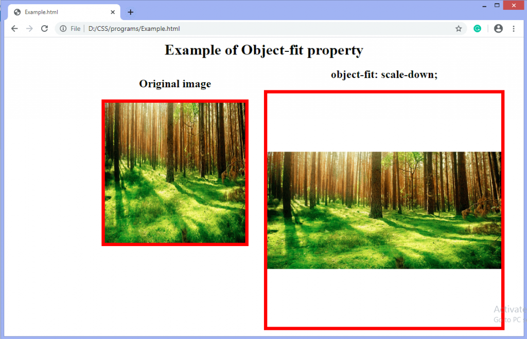
scale-down: It sized the content as none or as contain. It results in the smallest object size. It finds the smallest concrete object size by comparing the none and contain.
initial: It sets the property to its default value, i.e., the image is stretched to fit in the container because the default value is fill.
inherit: It inherits the value from its parent element.
Now, let’s understand the above property values by using an example of each.
Example: Using fill value
<html>
	<head>
		<style>
            body{
                text-align: center;
            }
            #img1{
                width: 300px;
                height: 300px;
                border: 7px solid red;
            }
            #obj {
                width: 460px;
                height: 460px;
                object-fit: fill;
                border: 7px solid red;
            }
            #left{
                float: left;
                text-align: center;
            }
            #center{
                float: right;
                text-align: center;
            }
         </style>
	</head>
	<body>
		<h1> Example of Object-fit property </h1>
		<div id="left">
			<h2> Original image </h2>
			<img id="img1" src="https://jslib.dev/demo/forest.jpg">
		</div>
		<div id= "center">
			<h2> object-fit: fill; </h2>
			<img id="obj" src="https://jslib.dev/demo/forest.jpg" width="300" height="300">
      	</div>
	</body>
</html>
Output

Example: Using contain value
<html>
	<head>
        <style>
            body{
                text-align: center;
            }
            #img1{
                width: 300px;
                height: 300px;
                border: 7px solid red;
            }
            #obj {
                 width: 460px;
                 height: 460px;
                 object-fit: contain;
                 border: 7px solid red;
            }
            #left{
                float: left;
                text-align: center;
            }
            #center{
                float: right;
                text-align: center;
            }
        </style>
	</head>
	<body>
		<h1> Example of Object-fit property </h1>
		<div id="left">
			<h2> Original image </h2>
			<img id="img1" src="https://jslib.dev/demo/forest.jpg">
		</div>
		<div id="center">
			<h2> object-fit: contain; </h2>
			<img id="obj" src="https://jslib.dev/demo/forest.jpg" width="300" height="300">
      	</div>
	</body>
</html>
Output

Example: Using cover value
<html>
	<head>
        <style>
            body{
              text-align: center;
            }
            #img1{
              width: 300px;
              height: 300px;
              border: 7px solid red;
            }
            #obj {
              width: 460px;
              height: 460px;
              object-fit: cover;
              border: 7px solid red;
            }
            #left{
              float: left;
              text-align: center;
            }
            #center{
              float: right;
              text-align: center;
            }
        </style>
	</head>
	<body>
		<h1> Example of Object-fit property </h1>
		<div id="left">
			<h2> Original image </h2>
			<img id="img1" src="https://jslib.dev/demo/forest.jpg">
		</div>
		<div id="center">
			<h2> object-fit: cover; </h2>
			<img id="obj" src="https://jslib.dev/demo/forest.jpg" width="300" height="300">
      	</div>
	</body>
</html>
Output

Example: Using none value
<html>
  <head>
      <style>
          body{
              text-align: center;
          }
          #img1{
              width: 300px;
              height: 300px;
              border: 7px solid red;
          }
          #obj {
              width: 460px;
              height: 460px;
              object-fit: none;
              border: 7px solid red;
          }
          #left{
              float: left;
              text-align: center;
          }
          #center{
              float: right;
              text-align: center;
          }
      </style>
  </head>
  <body>
	<h1> Example of Object-fit property </h1>
	<div id="left">
		<h2> Original image </h2>
		<img id="img1" src="https://jslib.dev/demo/forest.jpg">
	</div>
	<div id="center">
		<h2> object-fit: none; </h2>
		<img id="obj" src="https://jslib.dev/demo/forest.jpg" width="300" height="300">
    </div>
  </body>
</html>
Output

Example: Using scale-down value
<html>
  <head>
      <style>
          body{
              text-align: center;
          }
          #img1{
              width: 300px;
              height: 300px;
              border: 7px solid red;
          }
          #obj {
              width: 460px;
              height: 460px;
              object-fit: scale-down;
              border: 7px solid red;
          }
          #left{
              float: left;
              text-align: center;
          }
          #center{
              float: right;
              text-align: center;
          }
      </style>
  </head>
  <body>
  	<h1> Example of Object-fit property </h1>
  	<div id="left">
  		<h2> Original image </h2>
 		 <img id="img1" src="https://jslib.dev/demo/forest.jpg">
	</div>
  	<div id="center">
  		<h2> object-fit: scale-down; </h2>
  		<img id="obj" src="https://jslib.dev/demo/forest.jpg" width="300" height="300">
    </div>
  </body>
</html>
Output

Other resources
Browser support
It’s worth noting that iOS 8-9.3 and Safari 7-9.1 the object-fit property but not object-position.
Data on support for the mdn-css__properties__object-fit feature across the major browsers


 How to Become a Web Developer