
Flexbox is also known as The CSS Flexible Box Layout Module and it gives web designers complete control over how to arrange page items along an axis. Flexbox is used to create responsive menu bars, image galleries, product listings, and all kinds of other page components. The key point about Flexbox is the ability to make items flex, which changes their width and height to fill space in a given dimension. This enables page items to stretch and shrink inside their containers which reduces wasted space and overflow, making responsive layouts easier to craft.
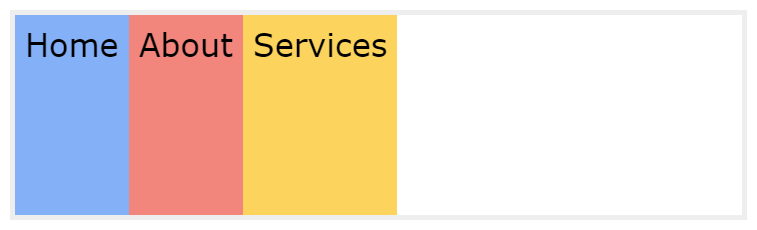
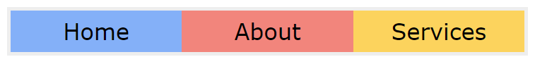
To get started with our first flexbox layout, we need to set up just a very basic container with some items in it. We will use the following html and css if you would like to follow along.
<body>
    <nav class="container">
        <div>Home</div>
        <div>About</div>
        <div>Services</div>
    </nav>
</body>
body {
margin: 10px;
font-family: Verdana;
}
.container {
border: 5px solid #eee;
}
.container>div {
padding: 10px;
text-align: center;
font-size: 2em;
}
.container>div:nth-child(1) {
background-color: #84b0f8;
}
.container>div:nth-child(2) {
background-color: #f2857c;
}
.container>div:nth-child(3) {
background-color: #fcd35d;
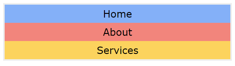
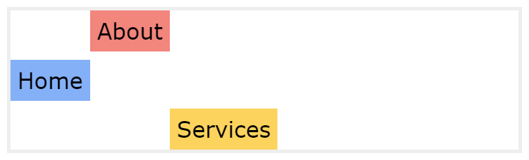
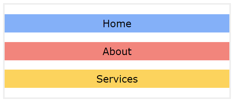
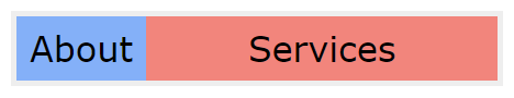
}This gives us about what we would expect as a result. Three block level elements, stacked on top of each other, and taking up the full width of the browser.’
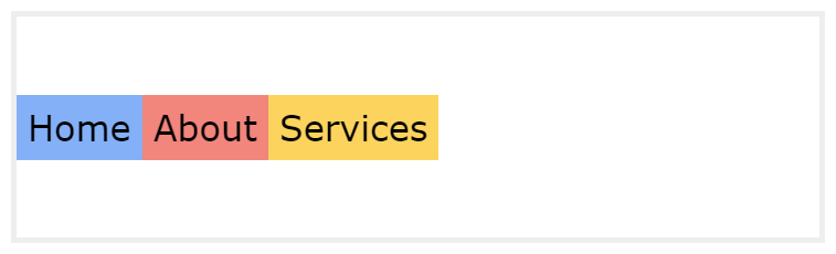
Container and Items
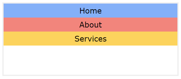
In flexbox we have a container and it’s items. These are the two components of any flexbox component. Any html element that is a direct child of the flexbox container, becomes a flexbox item. With that knowledge, we can now transform our block based display to a display of flexbox. All we need to do is add a display of flex to the container like so.
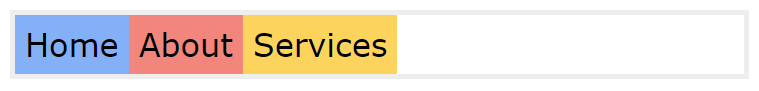
.container {
    display: flex;
}
By assigning display: flex; to the parent container, our items now arrange themselves horizontally instead of the original stacked behavior. This shows us that by default, flexbox displays items going from left to right in the container.
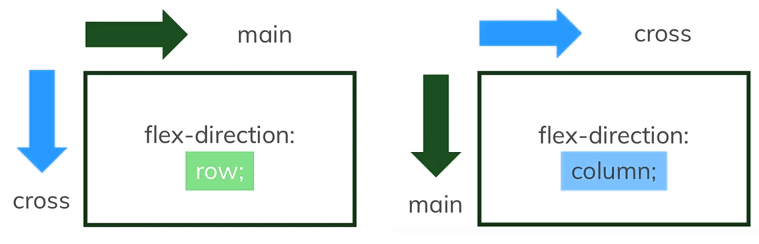
The Flexbox Axis (Main and Cross)
In flexbox we have what is known as a Main Axis which runs left to right, and a Cross Axis which runs top to bottom. This determines the direction of the flexbox container. A flexbox container always has a direction. By default, the direction is horizontal with items being displayed left to right. This is also known as a row. This is important because different css properties are used to control flexbox items based on whether they are in the main axis or the cross axis. The axis of the flexbox container is controlled with the flex-direction property.
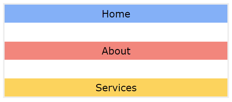
We can convert our first flexbox layout from a row to a column with this css.
.container {
    display: flex;
    flex-direction: column;
}
Now, the flexbox container stacks the items from top to bottom instead of left to right. Here is the tricky part. The top to bottom axis is now the Main Axis, and the left to right is the cross axis.
Here is a diagram to explain the concept visually.
The flex-direction: row; value is going to be enough for a very large number of use cases, and when just starting out with flexbox it makes sense to use row for learning.
Justify Content with Flexbox
Go ahead and put the flex-direction back to row, so that we have the left to right layout. Now, we will start to look at positioning flex items along the main axis. Since we are now back to flex-direction: row; – this means the main axis is running horizontally from left to right.
justify-content: flex-start;
This is the default, so the layout happens this way even if you do not explicitly specify it.
.container {
    display: flex;
    justify-content: flex-start;
}
justify-content: flex-end;
This value moves the flex items to the end of the flex container.
.container {
display: flex;
justify-content: flex-end;
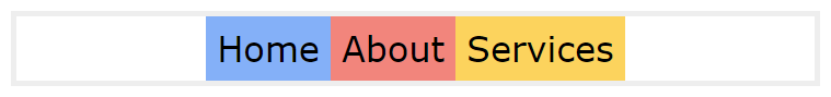
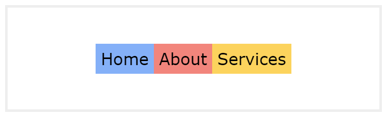
}justify-content: center;
Assigning center to the justify-content property aligns the flex items to the center of the flex container.
.container {
    display: flex;
    justify-content: center;
}
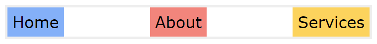
justify-content: space-between;
The space-between value puts an even amount of space between flex items, but does not add space on the ends.
.container {
    display: flex;
    justify-content: space-between;
}
justify-content: space-around;
Works just like above, except does add space at the ends.
.container {
    display: flex;
    justify-content: space-around;
}
Positioning Items in Flexbox
You are definitely going to need to position single flex items in a flexbox container in cases when the standard justify-content options we just discussed might not cut it. What if you want two flex items on one side, and the other flex item on the other side. We can use the margin property in this case. We need to start targeting individual items now, so we update each item to have a unique class.
<body>
    <nav class="container">
        <div class="home">Home</div>
        <div class="about">About</div>
        <div class="services">Services</div>
    </nav>
</body>
Imagine we want to move the Services item to the right, but leave the Home and About items as is. How can we do that? Let’s see this updated css now.
.container {
    display: flex;
}

.services {
    margin-left: auto;
}
This allows us to easily position single items along the main axis. Looks good!

To move both the About and Services items over, we can simply target the About item like so.
.container {
    display: flex;
}

.about {
    margin-left: auto;
}
The flex Property
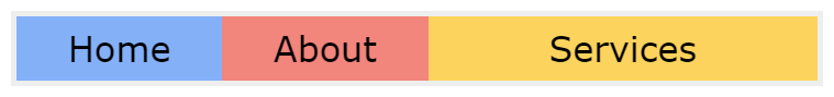
Your going to love this cool little property in flexbox. The flex property makes flex items become responsive inside the flexbox container and some really neat effects are possible with it. Imagine we want to have each flex item stretch all the way from left to right so each item takes up an equal amount of width. We can apply this css.
.container {
    display: flex;
}

.container > div {
    flex: 1;
}
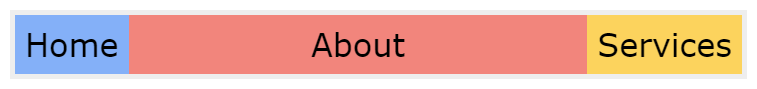
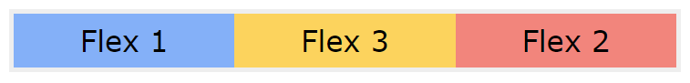
Now let’s make just one flex item two times as wide as the other items. We can target the Services item only, and set it’s flex to 2.
.container {
    display: flex;
}

.container > div {
    flex: 1;
}

.container > .services {
    flex: 2;
}
Many times you can simply set one item to do all of the flexing, while the others maintain a fixed width. In the example below, the About item will flex at all screen sizes while Home and Services keep a fixed width.
.container {
    display: flex;
}

.about {
    flex: 2;
}
Now we can also make two flex items grow and shrink, while the other maintains a fixed width. This example will have the About section maintaining a fixed width while the Home and Services sections dynamically grow and shrink.
.container {
    display: flex;
}

.home, .services {
    flex: 1;
}
Align Items with Flexbox
Let’s now look at how to position flex items along the Cross Axis. Remember, the Axis is determined based on the direction of the flex container. For simplicity, we are sticking with the flex direction of row. This means the Cross Axis is the top to bottom axis. By default, flex items will stretch themselves across the Cross Axis. To demonstrate this, we could make our flex container a height of 200 pixels, and each item will still fill the space from top to bottom. Check it out.
.container {
    display: flex;
    height: 200px;
}
When a flexbox container has a larger height than the flex items contained within, we can use the align-items property to position on the Cross Axis. Here are a few examples.
align-items: flex-start;
By assigning flex-start to the align-items property, flex items align to the top of the flex container.
.container {
    display: flex;
    height: 200px;
    align-items: flex-start;
}
align-items: center;
The center value puts flex items in the middle of the flex container.
.container {
    display: flex;
    height: 200px;
    align-items: center;
}
align-items: flex-end;
The flex-end value puts flex items at the bottom of the flex container.
.container {
    display: flex;
    height: 200px;
    align-items: flex-end;
}
align-items: baseline;
The baseline value lines up items in the flex container based on the content of each flex item. To demonstrate this, we need to actually change the containing content of each item. We can simply assign different font sizes to each flex item. Note that even though each flex item has different sized content, the bottom of the text for each item lines up perfectly.
.container {
    display: flex;
    height: 200px;
    align-items: baseline;
}
Perfect Centering With Flexbox
In what may have brought more happiness to web designers the world over is the ability to perfectly center an item both horizontally and vertically using flexbox. All you have to do is apply both align-items: center; and justify-content: center; to the flexbox container.
.container {
    display: flex;
    height: 200px;
    align-items: center;
    justify-content: center;
}
Aligning Single Flex Items
Just as with Justify earlier, we may want finer control over the way items are aligned on the cross axis. For this we can use align-self on individual flex items. In this first example, we can target our About section and move it to the top.
.container {
    display: flex;
    height: 200px;
    align-items: center;
}

.about {
    align-self: flex-start;
}
Now perhaps we want to target a different flex item and move it to the bottom. No problem.
.container {
    display: flex;
    height: 200px;
    align-items: center;
}

.about {
    align-self: flex-start;
}

.services {
    align-self: flex-end;
}
Change Axis Direction With column
Ok we’re making some great progress with Flexbox, are we having fun yet?! So, now we are going to throw a monkey wrench into this session and change how the flexbox container works entirely. In flexbox, remember the default flex-direction is row. This means items flow from left to right. It can also be column which will change the direction for items so that it is top to bottom. To confuse you more give you further control you may also reverse both of these with row-reverse and column-reverse! Additionally, the Main and Cross Axis is different for each scenario!
justify-content: flex-start;
.container {
    display: flex;
    height: 300px;
    flex-direction: column;
    justify-content: flex-start;
}
justify-content: flex-end;
.container {
    display: flex;
    height: 300px;
    flex-direction: column;
    justify-content: flex-end;
}
justify-content: center;
.container {
    display: flex;
    height: 300px;
    flex-direction: column;
    justify-content: center;
}
justify-content: space-between;
.container {
    display: flex;
    height: 300px;
    flex-direction: column;
    justify-content: space-between;
}
justify-content: space-around;
.container {
    display: flex;
    height: 300px;
    flex-direction: column;
    justify-content: space-around;
}
justify-content: space-evenly;
.container {
    display: flex;
    height: 300px;
    flex-direction: column;
    justify-content: space-evenly;
}
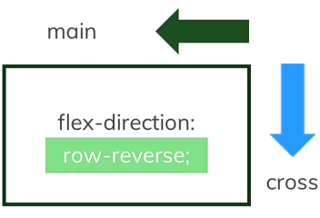
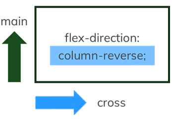
Flexbox Axis Summary
The Main Axix and Cross Axis change based on the flex-direction value.
flex-direction: row;
The main axis travels left to right and the cross axis travels top to bottom.

flex-direction: column;
The main axis travels top to bottom and the cross axis travels left to right.

flex-direction: row-reverse
The main axis travels right to left and the cross axis travels top to bottom.
flex-direction: column-reverse;
The main axis travels bottom to top and the cross axis travels left to right.
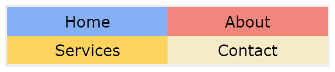
Wrapping in Flexbox
In float layouts, items wrap all the time. In flexbox, the default setting is for flex items to not wrap. Flex items will only wrap if the designer explicitly says so. To turn on wrapping, we can set flex-wrap to wrap. We can set each flex item to a wide value, say 343 pixels. We can also turn on the wrap feature like so.
.container {
    display: flex;
    flex-wrap: wrap;
}

.container > div {
    width: 343px;
}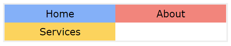
If we comment out the flex-wrap: wrap; declaration, the flex items will not wrap even though they are assigned a width that should clearly extend beyond the flex container. What happens in this scenario is that flexbox automatically scales down each list item to fit in the given space.
.container {
    display: flex;
    /* flex-wrap: wrap; */
}

.container > div {
    width: 343px;
}
Flex grow, shrink, and basis
We saw earlier how using the flex property allowed us to make each flex item automatically grow and shrink as needed. In other words, this one property made everything responsive. The flex property is actually a shorthand notation for using three other properties. Those are flex-grow, flex-shrink, and flex-basis. The following three css blocks are equivalent.
.about {
    flex: 1;
}
.about {
flex: 1 1 0;
}.about {
flex-grow: 1;
flex-shrink: 1;
flex-basis: 0;
}Let’s examine each property. The flex-basis property is a way of setting the initial main size of a flex item.
The flex-grow property sets the dynamic grow amount of a flex item. It determines how much of the available space in the flex container should be allotted to that flex item. If all sibling flex items have the same flex grow factor, then all items are given the same amount of available space. flex-grow determines how much of the extra space should be distributed to the various flex items.
The flex-shrink property sets the dynamic shrink factor of a flex item. Flex items will shrink to fill the container according to the value provided, when the default size of flex items is bigger than the flex container.
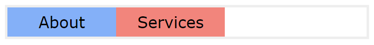
For example, consider our flexbox container now only has two flex items.
<body>
    <nav class="container">
        <div class="about">About</div>
        <div class="services">Services</div>
    </nav>
</body>
.container {
display: flex;
}
.about {
flex-basis: 200px;
}
.services {
flex-basis: 200px;
}With only the flex-basis set for each flex item, each item will not grow as the container expands. They will only take up a max width of 200 pixels. This will however shrink if the container collapses.
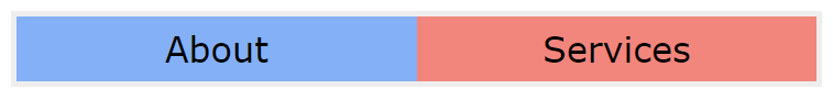
By adding the flex-grow property, the result is starting to act a bit more like setting just flex. Each item will grow equally as the container expands.
.container {
    display: flex;
}

.about {
    flex-grow: 1;
    flex-basis: 200px;
}

.services {
    flex-grow: 1;
    flex-basis: 200px;
}
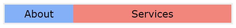
The following rules state the following. Both About and Services section will start at 200 pixels. Then, extra space will be allotted to Services and no extra space will be allotted to About.
.container {
    display: flex;
}

.about {
    flex-grow: 0;
    flex-basis: 200px;
}

.services {
    flex-grow: 1;
    flex-basis: 200px;
}
The last example for these properties will be flex-shrink. Notice that the About section has a flex-shrink of 1 while Services is 0. What this means is that if the container shrinks smaller than a size to allow at least the initial width of each flex item, then the About section will be the one to start shrinking while Services will not.
.container {
    display: flex;
}

.about {
    flex-grow: 0;
    flex-shrink: 1;
    flex-basis: 300px;
}

.services {
    flex-grow: 0;
    flex-shrink: 0;
    flex-basis: 300px;
}
How To Order with Flexbox
Flexbox has a feature that is similar to the CSS Grid, in that you can re order items visually, while leaving the underlying HTML markup in tact. We can change the HTML just a bit to make this ordering concept a bit easier to grasp. What we are going to do now is to rearrange how those flex items appear in the browser while not touching the HTML markup. We will only use the order property on the flex items.
<body>
    <nav class="container">
        <div class="flex1">Flex 1</div>
        <div class="flex2">Flex 2</div>
        <div class="flex3">Flex 3</div>
    </nav>
</body>
.container {
display: flex;
}
.container > div {
flex: 1;
}
.container > .flex2 {
order: 1;
}Setting item 2 with an order of 1 puts it last in the container.
The reason for the behavior above is that the order value is not the position location in the list of elements. The order value works by assuming all flex items start with an order of 0. The higher above 0 a flex item has, the further to the end it will be pushed. The further below 0 a number is (can be negative), the further to the start the item will be pushed. With that in mind, let’s try to make Item 2 come first, Item 3 come next, and Item 1 come last.
.container {
    display: flex;
}

.container > div {
    flex: 1;
}

.container > .flex1 {
    order: 30;
}

.container > .flex2 {
    order: 10;
}

.container > .flex3 {
    order: 20;
}
Looking below, we get the result we want. We used 10, 20, and 30 as values to demonstrate that the number value is not the position the item occupies. It is a weight so to speak. What happens is the browser looks at the value of all items and arranges them from lowest to highest. Flex item 2 has the lowest value of 10, so it comes first. The next lowest value is Flex item 3 with a value of 20, so it comes next. Flex item 1 has a value of 30, so it comes last.

Using Media Queries With Flexbox
A nice trick is to make use of CSS Media Queries when using Flexbox layouts. The reason for this is so that you can turn on flex-wrap and specify flex-basis when the viewport is smaller than a given size. First, let’s update our HTML to add another flex item.
<body>
    <nav class="container">
        <div class="home">Home</div>
        <div class="about">About</div>
        <div class="services">Services</div>
        <div class="contact">Contact</div>
    </nav>
</body>
We can start with this css for a regular desktop view.
.container {
    display: flex;
}

.container > div {
    flex: 1;
}
Now we want to create a tablet view. For tablet sized screens a nice two on two stacked design would be nice. For this, we can use this handy media query. What the css below says is that if the browser goes 700 pixels or lower, turn on flex wrap and make each flex item 50% flex basis. (46% to account for padding, margin, etc).
.container {
    display: flex;
}

.container > div {
    flex: 1;
}

@media all and (max-width: 700px) {
    .container {
        flex-wrap: wrap;
    }

    .container > div {
        flex: 1 1 46%;
    }
}
That gives us this nice layout on the tablet.
Finally, we can add media a query for the mobile view like so.
.container {
    display: flex;
}

.container > div {
    flex: 1;
}

@media all and (max-width: 700px) {
    .container {
        flex-wrap: wrap;
    }

    .container > div {
        flex: 1 1 46%;
    }
}

@media all and (max-width: 550px) {
    .container > div {
        flex: 1 1 100%;
    }
}
This provides a nice stacked menu on the mobile device for easy navigation.

Create an Image Grid with Flexbox
Flexbox makes it super easy to create image galleries too! Here we have some basic HTML markup for our image gallery.
<body>
    <nav class="container">
        <div class="home"><img src="art.jpeg"></div>
        <div class="home"><img src="boats.jpeg"></div>
        <div class="home"><img src="cat.jpeg"></div>
        <div class="home"><img src="city.jpeg"></div>
        <div class="home"><img src="cleaning.jpeg"></div>
        <div class="home"><img src="field.jpeg"></div>
        <div class="home"><img src="flowers.jpeg"></div>
        <div class="home"><img src="globe.jpeg"></div>
        <div class="home"><img src="hand.jpeg"></div>
        <div class="home"><img src="lake.jpeg"></div>
        <div class="home"><img src="plant.jpeg"></div>
        <div class="home"><img src="sailboat.jpeg"></div>
        <div class="home"><img src="sofa.jpeg"></div>
        <div class="home"><img src="street.jpeg"></div>
        <div class="home"><img src="tomato.jpeg"></div>
    </nav>
</body>
The only CSS we need is this!
.container {
    display: flex;
    flex-wrap: wrap;
    justify-content: center;
}

.container > div > img {
    width: 230px;
}

.container > div {
    flex: 1;
}
That alone gives us a pretty good-looking image gallery with just a few snippets of CSS.

Here are the Flexbox properties to know when working with Flexbox.
Flexbox Container Properties
- display: flex – Turns the element into a flex container
- flex-direction – Sets the direction flex items are placed in the flex container
- flex-wrap – Allows you to turn on wrapping of flex items which is off by default
- flex-flow – A shorthand notation for flex-direction and flex-wrap
- justify-content – Determines how space is allotted between items on the Main Axis
- align-content – Aligns flex items on the Cross Axis
- align-items – Determines how space is allotted between items on the Cross Axis
Flexbox Item Properties
- align-self – Overrides align-items to align a single item on the Cross Axis
- flex – Combines flex-grow, flex-shrink, and flex-basis into one property – determines how flex items change dimensions to fit available space
- flex-grow – Determines how much the flex item is allowed to grow to fill extra space in the flex container
- flex-shrink – Determines how much the flex item is allowed to shrink when there is not enough room in the flex container
- order – a number value provided – lower number items move left, higher number items move right
Test Out The Flexbox Properties!
Click the properties below to see how they affect the flex items in the flex container using the Flexbox Playground!
Learn More About Flexbox
Here are some additional articles about Flexbox you might enjoy!
- CSS Flexbox Interactive Tutorial with Cheat Sheet (Free Code Camp)
- A Complete Guide to Flexbox (CSS-Tricks)
- Flexbox Tutorial for Beginners (Tutorials Point)
- Basic concepts of flexbox (Mozilla Developers Network)
- A Guide to Flexbox Alignment (Web Design Tuts)
- An Introduction to Flexbox for Beginners (SitePoint)

 Introduction To React.js